Client:
ASCO Power Technologies
My role:
Project Lead, UX Research, UX Design, Visual Design
Challenge:
ASCO Power Technologies is a global leader in the manufacturing of transfer switches, paralleling switchgear, power control, load banks and surge devices. They were developing their first human machine interfaces (HMIs) and ready for a design review. ASCO contracted our Innovation Center, whose mission was to stimulate innovation and develop of a common look and feel across Emerson products and services. We were tasked with appraising their inaugural Touch Display Interface (TDI) on their Automatic Transfer Switch product line.
Approach:
Phase I: As the Innovation Center’s Visual Designer, I reviewed the TDI designs.
- I evaluated the user interface design utilizing Emerson’s 10 usability heuristics: match, complexity, consistency, place, constraints, anticipate, language, feedback, errors, and aesthetics.
- I documented my assessment of each screen in a detailed, written report to ASCO product managers.
- I proposed an interaction redesign by my Innovation Center to simplify the software’s information architecture, update its visual look to match Emerson user interfaces, and modernize its appearance.
Phase II: ASCO eagerly approved the proposed redesign. I teamed up with our Information Designer and Project Manager.
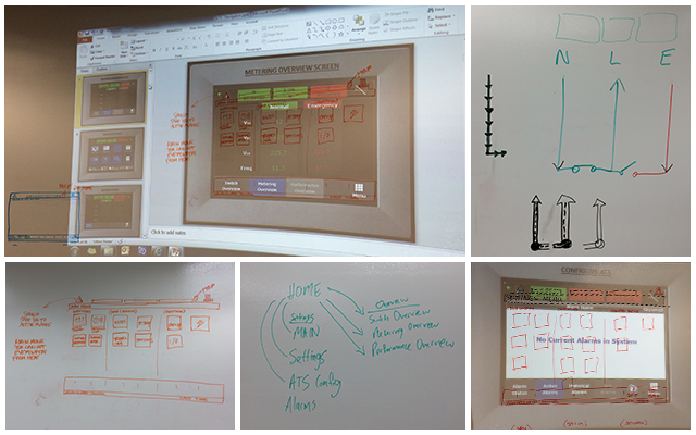
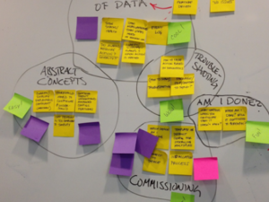
- We analyzed the variety of application screens to sort them into categories based on their usage, priority, and function.
- Projecting each screen on a white board wall, we visually:
– analyzed consistencies
– minimized complexity
– brainstormed use case hierarchy
– anticipated user needs and errors
– provided users feedback to their actions and status
– assigned a layout structure to orient users to their location in the software and provide reliable organization
– organized assets for use by global implementation teams
Result:
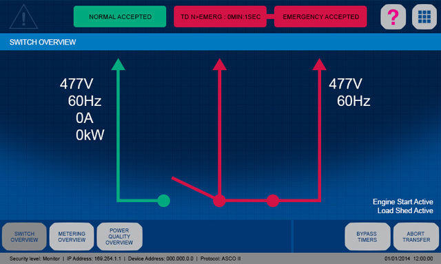
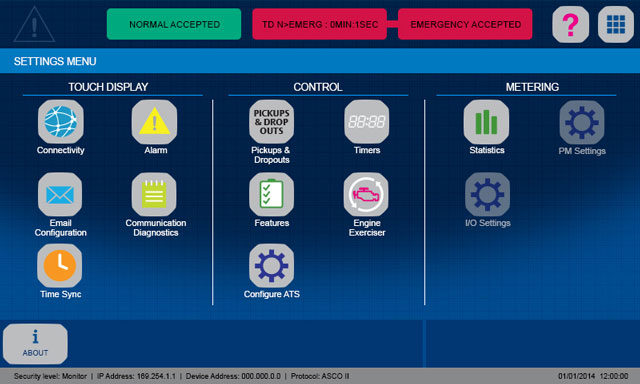
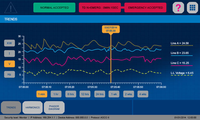
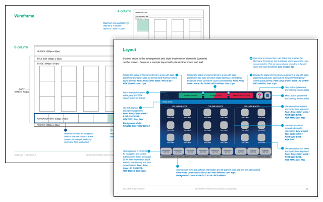
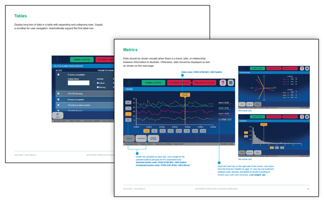
Our team found a number of opportunities for enhancement, unity, and simplification. We identified and rationalized a set of user interface elements such as a wireframe, screen templates, and icons to drive consistency for ASCO’s user interface designs.
The project culminated in my development of the ASCO Power Design Guide to illustrate our HMI specifications and position future designers and developers of ASCO’s HMIs to apply and propagate this work. This Design Guide reiterated the established Emerson HMI philosophy, basic visual elements, and branding while introducing the first ASCO embodiment, the TDI for Automatic Transfer Switches. The user interface elements for TDI spans the use of color, wireframes, and a collection of specialized screen designs to drive the best user experience with the product.
Of Note:
★ The ASCO product manager highly praised my novel yet simple addition of a visual indicator to the software. It displayed the current source of power on every screen without requiring users to return to the home screen to view it. He was impressed his team hadn’t already established such an indicator.
★ Video of the final touch screen still in use today can be viewed here.
